


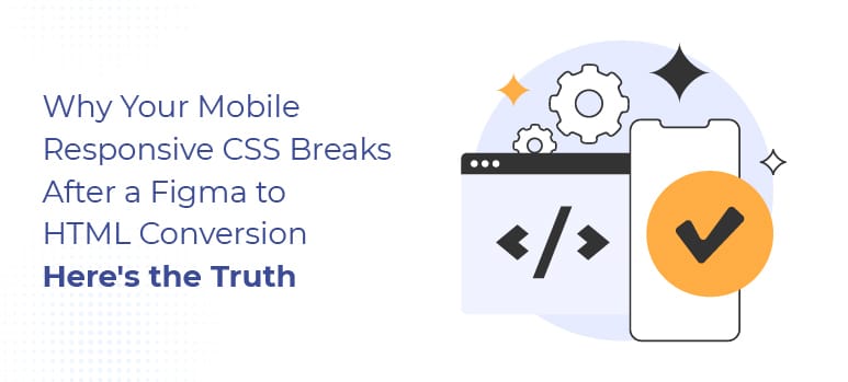
Why Your Mobile Responsive CSS Breaks After a Figma to HTML Conversion — Here’s the Truth
You spent weeks perfecting your Figma design. The developer carefully planned every breakpoint and precisely placed every element for desktop, tablet, and mobile. Then the HTML came back and something went wrong. Buttons are overlapping. Text is overflowing. The layout that looked flawless in Figma is collapsing on a phone screen.
You are not alone. Mobile responsive CSS breaking after a Figma to HTML conversion is one of the most common complaints designers and project owners face and in almost every case, the problem is not your design. It’s way of coding is the problem.
This article breaks down exactly why this happens, what to look for, and what a proper Figma to HTML conversion actually delivers so you never have to deal with this again.
The Real Reasons Your Mobile Responsive CSS Breaks After a Figma to HTML Conversion
1. The Developer Ignored Figma’s Responsive Frames Entirely
Figma provides an option to set up three different frames for desktop, tablet, and mobile devices to serve as a “responsive blueprint” that will inform the developer of the expected layout behavior for each screen size.
The number one reason for mobile responsive CSS to break is that developers will only code the CSS for a desktop version and leave all the other views to “guess” how they will behave. Instead of creating proper CSS media query breakpoints that match the breakpoints in the Figma frames for the each of the device sizes, developers tend to just create one stylesheet and then hope it will resize itself to match the way it should look on the other views. It will never work.
When you perform a proper Figma to CSS conversion, you treat each Figma frame as a separate CSS breakpoint. This means you code the mobile layout intentionally instead of letting it inherit styles from the desktop version as an afterthought.
2. Figma Auto Layout Was Translated Into Fixed Pixel Values
Auto Layout is one of Figma’s most powerful features. It lets elements resize, reorder, and reflow naturally mimicking how Flexbox and CSS Grid behave in a browser. When a developer truly understands both Figma and CSS, Auto Layout maps cleanly to display: flex or display: grid with fluid, responsive properties.
When they don’t understand it, Auto Layout gets translated into fixed pixel values. A container that should stretch to fill its parent becomes width: 1280px. A row that should wrap on mobile becomes a locked horizontal block that overflows off the screen on a phone.
The fix is not a CSS patch. It requires rebuilding those elements properly from scratch using Flexbox or Grid with relative units the way they should have been written the first time.
3. No Media Queries Were Written Or They Were Written Wrong
Media queries are the backbone of mobile responsive CSS. They tell the browser: at this screen width, apply these styles. Without them, your website has exactly one layout whatever was coded for the desktop stretched or squashed onto every other screen.
Some developers write media queries but target the wrong breakpoints. Figma designs often use breakpoints at 1440px, 1024px, 768px, and 375px. If the developer targets 1200px, 992px, and 576px instead common Bootstrap defaults your carefully designed layouts will never trigger at the right sizes.
The result is a website that looks broken at exactly the screen sizes your users are on, even though technically media queries exist in the code.
4. Figma Constraints Were Completely Ignored
Figma uses constraint settings for every design element to define how it should behave relative to its parent frame when the frame is resized. An element set to “scale” should shrink proportionally. Element set to “left and right” should stretch. An element set to “center” should stay centered.
These constraints are intentional design decisions. They are also completely invisible to a developer who is not paying close attention.
When constraints are ignored, fixed-width elements do not stretch on larger screens. Centered elements drift to the left. Full-width sections stop at an arbitrary pixel value. Every one of these issues becomes a mobile responsive CSS problem that looks like a bug but is actually a missed design instruction.
5. Images and Media Were Not Made Responsive
Images are the silent killers of mobile responsive CSS. A hero image coded at width: 1440px will extend far beyond the edge of a phone screen. A background image set with fixed pixel dimensions will not scale, crop, or reposition the way it does in your Figma mobile frame.
Responsive images require max-width: 100%, object-fit properties, and often separate srcset attributes for different screen sizes. Background images need media queries that swap or reposition them at smaller breakpoints.
When developers skip this step, images overflow their containers, break the page grid, and cause horizontal scrolling one of the most noticeable and frustrating mobile issues visitors can experience.
6. The Code Was Never Tested on a Real Mobile Device
This one sounds obvious. It is shockingly common.
A developer who only tests in a browser’s responsive mode. Dragging the window smaller on their desktop will miss a huge range of real mobile issues. Browser DevTools are useful, but they do not replicate actual touch behavior. Real viewport rendering, font rendering differences, or the way iOS Safari and Android Chrome handle overflow, fixed positioning, and viewport units differently.
A proper Figma to HTML conversion includes cross-device QA testing. Where developers check the output on real phones, tablets, and multiple browsers before delivering the project. If your developer skipped that step, the mobile CSS problems you found were always there. They just were not looking.
7. You Hired a Developer Who Codes Not a Specialist Who Converts
This is the root cause underneath every point above.
Converting Figma to responsive HTML is a specialist skill. It requires a developer who understands both Figma’s design system Auto Layout, constraints, components, variables, frames and front-end CSS at a professional level. A general WordPress developer, a backend developer who “also does HTML,” or a plugin-based conversion tool can produce code. That looks right on a desktop and falls apart everywhere else.
The difference between a generalist and a specialist shows up exactly here in the mobile responsive CSS. A specialist does not guess at breakpoints. They do not translate Auto Layout into fixed pixels. They do not skip device testing. And they do not deliver a project without running it through a full QA process first.
Final Thoughts
If your Figma to HTML conversion breaks after converting, this is not by chance. You usually fail a conversion when you ignore Figma frames, set unrealistic expectations, skip proper testing, lack the right front-end experience, or fail to create a mobile-responsive CSS file.
However, proactive planning helps you avoid any combination of these issues before they happen. You need to find a team that approaches your Figma to HTML conversion as an actual “craft” something they love doing and not a “side task.”
At Pixel Perfect HTML, we have created and documented our structured 9-step process for every Figma to HTML conversion project: Requirement analysis and design/project manager, Full QA testing on all major browsers/devices. All of our Figma to HTML conversions are W3C compliant (both semantic & markup), and all of them perfectly represent the client’s original Figma file regardless of any screen size.
About the Author