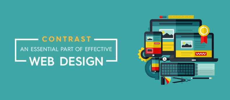
Contrast – An essential part of effective web design
The technique of contrast is one of the vital aspects that influences the final product and relates it to the readers. Contrast has been the cornerstone for the content on a website page that gives the website an edge over others. This contrast is ideally achieved using three necessary aspects of designing i.e. the size, alignment and color.
Let’s have a closer look at how these three aspects can help designers achieve the desired results
- Contrast in Color
- Contrast in Size
- Contrast in Alignment
Contrast in Color
Most people consider contrast as associated with color. Although the techniques of contrast are not merely restricted to color, it can help the user distinguish the pages from one another.
It’s quite obvious that most web designs have a header, footer and the body as a content area. All these are totally different aspects and parts having a different area that must have a clear visual separation. This is where contrast in background color plays a great role to achieve this separation.
Contrast in Size
When facilitating multiple sizes to format the different component of a page, contrast can make a web page look dramatically different. By enlarging and reducing the size of characters you can create a specific contrast for browsing content / text, particularly when there is a limited choice in color. You can develop a contrast within your content by highlighting important texts in relation to the rest. By making the content bigger, you can easily attract your users without making any extra effort.
Contrast in Alignment
Accurate alignment is also a great way creating a quality web design. It can work well if lined up well. But using multiple alignments for creating contrast is somewhat tricky and it should be used occasionally.
The basic rule using contract in alignment is centering of large paragraphs should be avoided or else it will ruin the readability of the text. On the contrast, club left aligned paragraphs with centralized headlines. It can be a great way to create the difference in alignment to display contrast. This can be merged with a great serif font, which will offer your typography a classic appeal.
Learning to develop the accurate quantity of contrast in your designs is similar to learning any other technique of design – it needs practice. Study the work of expert and widely accomplished designers and understand how they use contrast in their designs for better results. It is all about creating a difference. If two components are very distinct in appeal, make sure that visual differences very clear and bold.