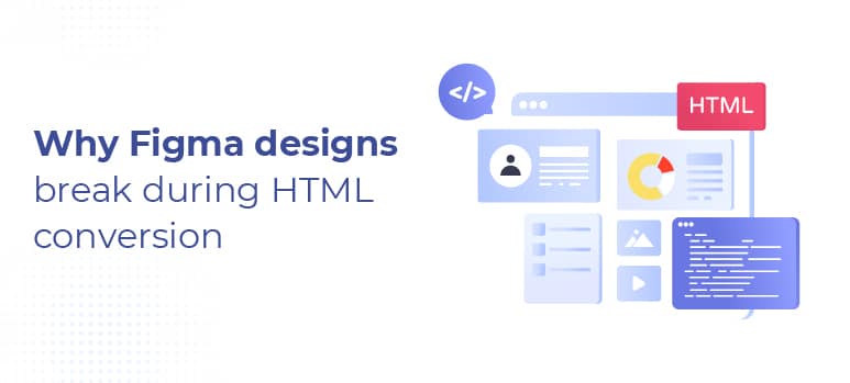
Why Figma Designs Break During HTML Conversion (And How to Prevent It)
Many designers and developers have had the same question,
“The design looked perfect in Figma — why does the live site look different?”
The developers run into Figma-to-HTML conversion issues such as spacing changes, different fonts, and inconsistent element behavior. This creates significant confusion among all the team members when trying to identify when the break happened.
In almost every case, the break happened because the design tools do not work the same as browsers, and designers are not always aware of this when they are creating the designs.
This article is focused on discussing why designs made in Figma to HTML conversion consistently break down and how common this is. We will also provide ideas for how teams can prevent HTML conversion breaks, regardless if the designs were built in-house or outsourced, or if the designs were created through a combination of both methods.
The objective is not to frame the discussion in a blame manner but to create an understanding of the communication gap that exists between design and code.
What Causes Figma Designs to Break During HTML Conversion?
The majority of Figma design files will not convert perfectly to HTML because of the absence of defined responsive behaviour, missing interaction states, font rendering inconsistencies, layout assumptions and unrealistic expectations with respect to pixel perfect.
When these gaps exist, they are not errors on the part of the designer or the developer; they are simply problems that exist due to how a designer intended to visually represent an idea and how that can be converted into code.
If these gaps are not addressed prior to development, developers have to make assumptions and this creates an environment in which tidiness begins to erode.
Figma Is a Design Tool, Not a Production Blueprint
It excels in visual communication.
and also enables designers to:
- Develop very detailed layouts
- Visually manage the spacing of items on their creations
- Provide a visual representation of the ideal state of their design
- Ignore limitations imposed by web browsers.
Web browsers do not operate as design templates.
A designer using HTML and CSS will have to account for several aspects when determining how to implement their designs, including:
- Fluidity of screens.
- Differences in font rendering.
- Guidelines for accessibility.
- Variability of content.
Evaluations of how users will actually interact with their designs.
If a design is treated like an actual architectural blueprint as opposed to a visual design intention, the likelihood of creating misalignment is greatly increased.
The main difference is as follows:
- Figma indicates how something is supposed to look.
- HTML indicates how something has to function.
Undefined Responsive Behavior Forces Assumptions
The majority of Figma Files are designed for the Desktop. Examples of how this can be problematic are:
- No Tablet Designs.
- No detailed Mobile Designs. The only Mobile frame is a general one that does not take into account all of the possible cases.
- No Specification of how Components Reflow (to create Responsive Designs).
- Fixed Spacing between Components is not scalable.
The developer, when faced with one of these issues, must also make decisions on:
- How to Collapse Spaces.
- When to Wrap Components.
- How to Resize Text.
- Which Component to Prioritize.
The Developer makes what they believe to be reasonable decisions regarding the above, and those decisions may not match the Designer’s intent. The assumption or belief is what is breaking down Design.
Auto Layout Doesn’t Translate 1:1 to CSS
Many new designers are confused about what Auto Layout is in Figma.
They believe that;
- Auto Layout is like Flexible CSS in that it creates a quick way for Web designers to create great layouts.
- Nesting is representative of a designer’s architecture in the design process.
- Visual groupings illustrate how layout is being applied through Figma.
However;
- The number of deep nests increases the size of the CSS, which increases complexity.
- Visual layout does not necessarily correspond to how the CSS models are being created.
- While Figma may provide fantastic UI capabilities for excuse the many options available, there is an extensive difference between Figma and HTML when it is finished.
The difference between Figma and HTML does not mean that there is a flaw or flaw in the design, but rather creates significant roadblocks in the translation of the design into the finished HTML.
Fonts and Rendering Behave Differently in Browsers
That is one of the biggest reasons for complaint with “pixel perfect”.
The primary differences in rendering fonts arise because:
- Different browsers are able to render fonts differently
- Different operating systems use different methods of smoothing fonts
- There can be multiple ways to “fall back” on different fonts
- Line-height calculations may not render visually the same as they do within the Figma application.
The layout may look to be aligned with your original design and will shift by a few pixels in the browser when viewed on different browsers — even when coded correctly.
It is important to understand that technically there will never be perfect visual parity (closeness) across all browsers and devices (from a development perspective).
While this does not diminish the importance of developing accurate websites, it is still important to set expectations regarding how closely your website will be rendered based on your expectations.
Interaction and State Designs Are Often Missing
Default states are included in nearly all Figma designs; however, there are missing elements such as the following:
- Hover
- Focus
- Active
- Error
- Disabled
- Accessibility
When none of these have been designed and communicated clearly, the following occurs:
- Developers wind up inventing them,
- QA feedback is based on opinion, and
- Revisions accumulate late in development.
In the end, it appears as if “things break”; when actually, they were not properly defined.
“Pixel-Perfect” Without Tolerances Creates Friction
One of the most common misconceptions of a design-to-HTML workflow is “pixel-perfect”.
When a client says “I want pixel-perfect”, they do not mean:
- No differences between devices
- No differences in how I render each time
- No interpretation by anyone
What “pixel-perfect” means is:
- Very high level of visual fidelity
- All designers achieve the same intent
- Precision is where it really counts
If you don’t define tolerances, your review process will be based on subjective opinions about:
- 1 pixel matters here
- 1 pixel doesn’t matter there
- There is no agreement on where the line is drawn
This erosion of trust occurs at that point.
The truth is: Pixel-perfect is a result — not a means to an end.
Why This Feels Like a Development Problem (But Isn’t)
When HTML conversion fails to produce a design as expected, it is Development that will be visible and hence be blamed for the issue.
Yet the majority of issues can be traced back to earlier in the process:
1. Undefined decisions
2. Missing states
3. Incorrect assumptions
4. Uncommunicated expectations
Development reveals those gaps to the team. Therefore, more experienced teams focus less on fixing defects and more on preventing the potential for ambiguity.
How to Prevent Figma Designs From Breaking
Without continued clarification on design-to-HTML and early shared vision, you can experience many design-to-HTML issues. The teams experiencing the least number of issues typically:
- Utilize a build-ready design checklist.
- Outline how their designs will respond at the various breakpoints.
- Define the state of the interaction and when they apply to accessibility requirements.
- Build consensus early on the accuracy of pixel tolerances.
- Conduct design reviews with regard for development constraints.
- Agree on Quality Assurance Standards for the development process prior to beginning the development build.
The goal is not perfection; the goal is to understand each other.
Are Figma Design Breaks a Design or Development Issue?
Generally speaking, poor designs or development won’t be responsible for breaking Figma Files.
A common reason that will occur is because the original design did not translate into a final, working (build-able) decision.
By Aligning Designers, Developers and other Team Members on Expectations Early in the process of building the HTML will allow for a much more predictable outcome and much less frustration.
Final Thoughts
Incredible design tool = Figma, but not a browser.
When designers treat design files as visual intent instead of explicit instructions, that’s when we see quicker, easier, and far less stressful front-end production.
The majority of the time a design is called “broken,” it is simply an issue of the conversations surrounding the design having yet to be completed.