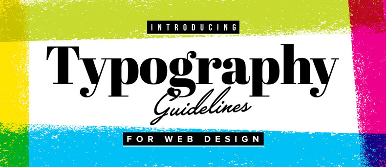
Typography guidelines for Web design
Have you ever wondered what makes a good design great? A design has many elements but one that distinguishes your design from others is Typography. Typography is the only difference between the good and a great design. Typography is simply known as the art and technique of arranging the textual content. It’s not only a skill of the designer; it is much more than making the words legible. The right choice of typeface and how a designer works with the layouts, grid, color scheme, and design theme will make a great difference between the good and the bad design. There are many typography tutorials available for you to master typography, still, you must need proper guidelines to kick start it.
Kerning with care
Kerning is adjusting space between two letters in the given fonts. Expensive programs like Adobe Illustrator are helpful for providing automatic kerning woes, still being a designer; you will come forth with many problems of kerning while using this software. All you need is to become a master for adjusting the exact space between the letters for great user experience.
Kerning can get complicated when dealing with web fonts and CSS, but are quite easy to fix if you are creating text as a graphic in Illustrator. You just need to insert your cursor between two characters and use the option (PC = alt) key in conjunction with the left and right arrow keys to adjust the spacing. Next thing is not to focus on the letters so much as the negative space between the letters. Try to make this space visually consistent throughout the phrase.
Use typography as Art
If you are thinking that typography is just a written text containing headings and, then you are wrong.. You can create typefaces that are considered as an art and can showcase them on different platforms or can use them to attract your readers or visitors. Treat typography like a unique art and make great designs by using all its elements
Tracking the measurement
The word ‘Measure’ acknowledges to the width of your text. Keeping it too narrow will probably make it harder for the readers to switch from one line to another. Likewise, keeping it too wide will require a lot of eye movement to read. You have to find out the proper measurement for your fonts that will comfy your readers.
Studious hierarchy
Hierarchy is important to maintain the flow of your web content. It’s obligatory to maintain the visual hierarchy by modifying the content. You can use large and bold heading, for primary content and smaller headings for secondary content. Further, you can add a visual charm by using a lighter shade for all the less important text of the web pages. You also need to select the proper font for the secondary logo or tag lines that completely blends with the font of your logo.
Align the Text
Alignment is the most important factor in every typography. Junior designers tend to center align everything for getting the balanced design. Research shows that center alignment is the weakest and hardest alignment to read. Being a designer, you should provide facility to your users to easily read and understand what you mean, what your motto of this design and how beautifully you described it. Besides, it’s not necessary to use one type of alignment all the time. All you need is to experiment with your design and text alignment to shape your imagination perfectly.
Limited usage of fonts
Make sure to use only 3 font faces. Also, it is better to limit the sizes and colors to avoid any kind of reader’s confusion. I prefer to go with two font faces, as this will help you to prevent excessive variations to the existing design. Correct fonts provide effective results as they are always associated with the psychology of your readers. Every font communicates certain attributes on both a conscious and subconscious level. Two of the major areas of communication are gender and era. If you are using more and improper font regardless gender and era, the user might not read the text.
I hope the above guidelines will help you to gain your desired excellence in typography. So, move on and make it a habit of following these guidelines and you will find how typography would become a fun activity for you.