Beware of these 15 mistakes that makes your website look unprofessional
Internet is something that has overpowered the human and mundane ways of functioning. With the average human being’s drastic change in the lifestyle with the emergence of the internet, we have nothing more to say on its behalf. We use internet not on a daily basis but on hourly basis today. Socialize, shop , learn and what not!! There is always a reason to use the internet. Among all this, many people have open to the concept of owning a site either to promote their services or products or for just putting their irrational and crazy self out there.
If you have your own site, then ensure that there are a lot of reasons for people to be back at your site. Because, internet has its fair share of pathetic websites that have horrible services and some of them have such an eye-piercing look that you don’t have to stay at that website for even a second. So, what makes or breaks a website? Want to find out? Then read on and you will thank us for correcting your misconceptions and mistakes.
15 mistakes that makes your website look unprofessional
- The design and the appearance
- Invest in the themes for the longer run
- The default designs won’t help
- The fonts have a huge impact
- Usability should be smooth
- The purpose of the site should be clear
- Use minimal forms
- Content matters a lot
- Put enough contact information
- Get rid of the stuff that is not needed
- Direct your visitor to one call of action
- The white spaces and the background colour
- Stay updated with the trend
- Consistent
- Avoid the short hand language
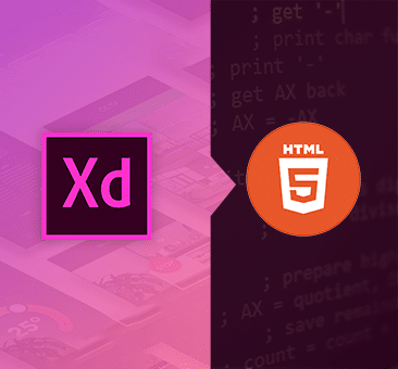
The design and the appearance
Just like the first impressions matter in an interview, your websites are no exception. If the design and the appearance of your website is not up to the mark, then the visitor will close your site in a second and they would never ever want to return to your site.
Invest in the themes for the longer run
Your products and services might be extremely good and how do you show this to your visitors and prospective clients? By having the right kind of theme and background that matches with the layout of your site!!
This is the first impression that your customers will have about you, make sure it is impressive and not cheap.
The default designs won’t help
You can only get more visitors for your site if it stands out from the rest of the crowd. This won’t be possible if you are customising your online site with the default theme or layout as every second website.
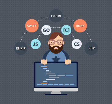
The fonts have a huge impact
When you are investing low amounts of money on your site, then you won’t be able to get the right kind of fonts for your site. The fonts on your website can make it look professional if they are done in the right manner and proportions. So, don’t mess with this important aspect of your website and you will see a lot of positive change.
Usability should be smooth
Don’t test the patience of your visitors by the errors and glitches. If your website has such issues, then fix it. moreover, your site should work on all the types of browsers and only god can save your site if it takes ages for your site to load and function.
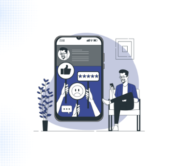
The purpose of the site should be clear
People are coming to your site for some imformation and if they don’t find the right content on your site, they have many options and they will move on to the better ones. Ensure that your site has the accurate and updated information that describes your site and shows your visitors that their time is valued.
Use minimal forms
Do you like to fill out forms before visiting a shopping mall? No, right!! Then don’t drive away the important visitors from your site by asking for too much information. Keep the forms really simple and ask for the information that is really needed instead of asking for all the details right away. Don’t make your site intimidating by having end number of forms.
Content matters a lot
While you are trying to get an audience for your site, it won’t help if you have don’t have the right kind of content on your site. It should not only be professional and error free but also be highly appropriate. Beating around the bush will not help you as people don’t want to waste their time. So, get to the point and stick to it.
Put enough contact information
You are a business site and you haven’t put the contact information on your website? This is one of the worst things that you could do if you are planning to make a big business. your prospective clients cannot contact you if there is no information on your business site.
Get rid of the stuff that is not needed
A very common problem with many sites is putting a lot of unnecessary elements on your website. Having an introductory video or page that has to be loaded before the visitors can proceed any further will not do your site any good. So, remove it right away and other such unwanted stuff from your website.
Direct your visitor to one call of action
You give the introduction to your website and then you display three options to choose from!! don’t confuse your prospective clients by giving them multiple options and stick to one thing at a time.
The white spaces and the background colour
For giving a bold impression, you need to balance the colour and the white spaces. Don’t clutter everything by missing out on the spaces. At the same time, ensure that there is not a lot of blank spaces which will make your website bland.
Stay updated with the trend
This is very important as the internet is coming up with new designs and trends every day. This will help your site look innovative and not some yesteryear’s copy of design.
Consistent
Ensure that your site is consistent with every kind of social media plug ins. The font should not be over the top and suite the sites.
Avoid the short hand language
This is a big turn off and being a business site, you need to be professional. Your site should not have any short hand language or slang. Trust me, it is cool but downright annoying.
Keep these pointers in mind to ensure that your site is up to date and looks professional.